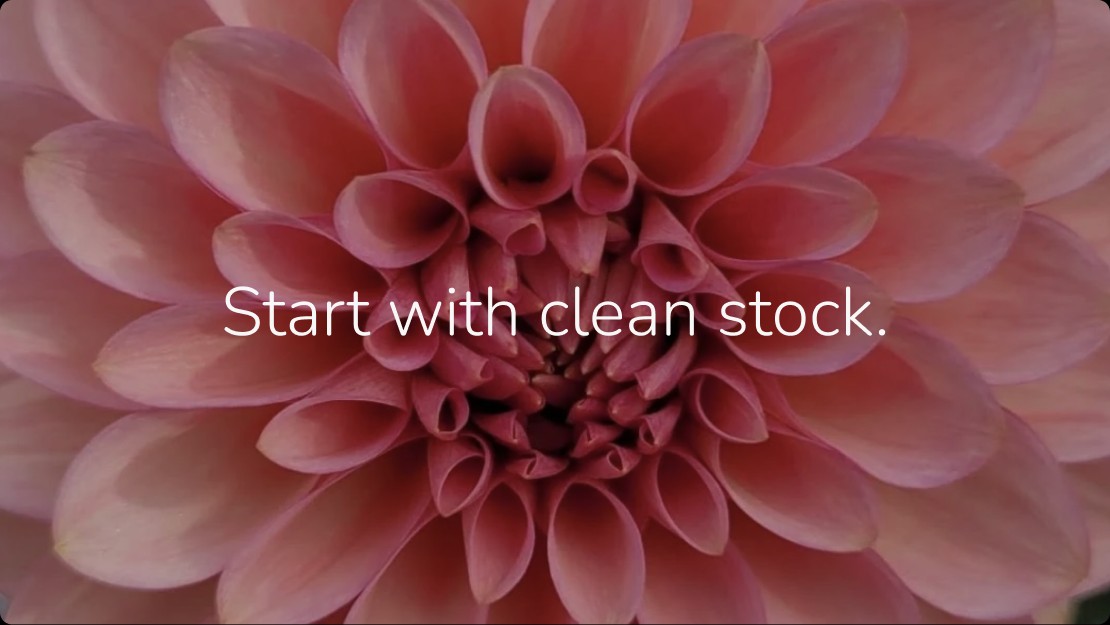
CASE STUDY · KAYA BLOOMS
KAYA BLOOMS.
A brand rooted in the quiet wisdom of nature, where beauty begins with intention, every plant is nurtured with care, and the integrity of what we grow is as important as the beauty it brings into the world.
- CLIENT
- Kaya Blooms
- WHERE
- Sauvie Island, Oregon
- THE WORK
- Brand · Visual Identity · Verification System · Content & Campaign
- THE GOAL
- Make clean stock something growers can see, and want.
- STUDIO
- Design Hierarchy
- CREATIVE DIRECTION
- Ahmer • Brian • Stephanie
- SECTOR
- Horticulture · Flower Farming · Plant Health
- AUDIENCE
- Dahlia growers and gardeners
THE BRIEF
MORE THAN PRETTY FLOWERS.
Kaya Blooms is a dahlia farm in Oregon built on a promise most growers can’t make: every mother plant is virus tested before it’s propagated.
Each bloom a story, each season a chapter. Hierarchy was brought in to give that care a brand: an identity, a way to prove what Kaya does, and a voice that makes growers care about what they can’t see.


VISUAL IDENTITY
A MARK THAT BLOOMS.
A circle of florets, arranged like sacred geometry, for the eternal cycle of nature.
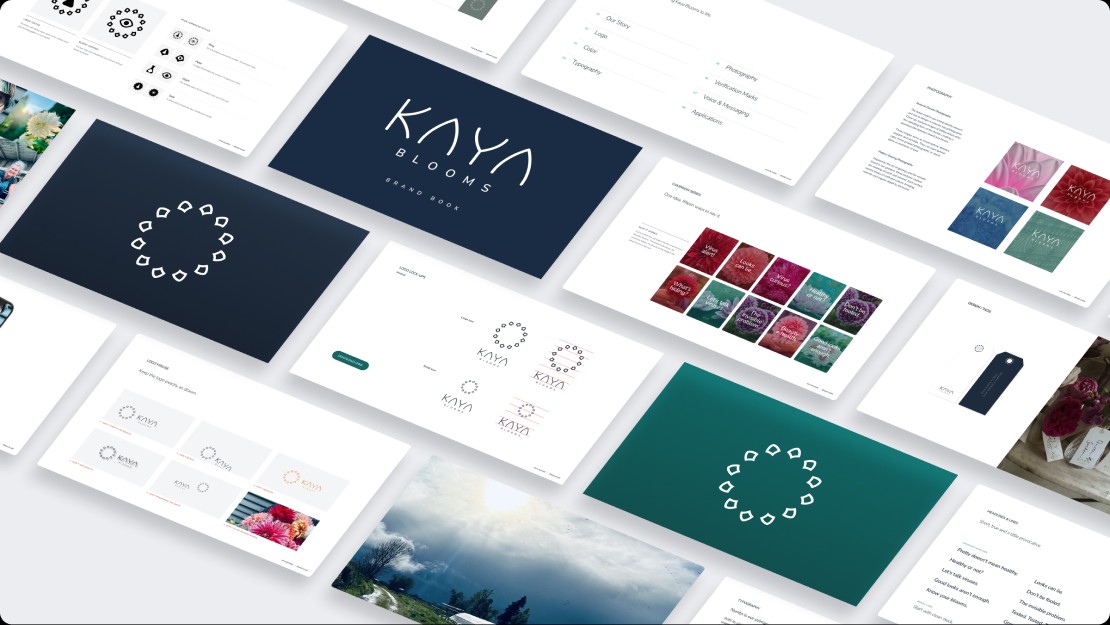
The wordmark’s open, curved forms mirror unfolding petals. Nunito carries the same warmth into every word, and a palette of deep navy, teal and garden greens grounds it in the farm. The full system lives in a brand book.
PHOTOGRAPHY
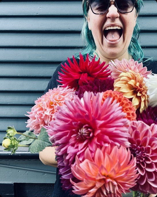
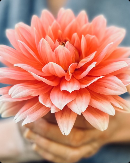
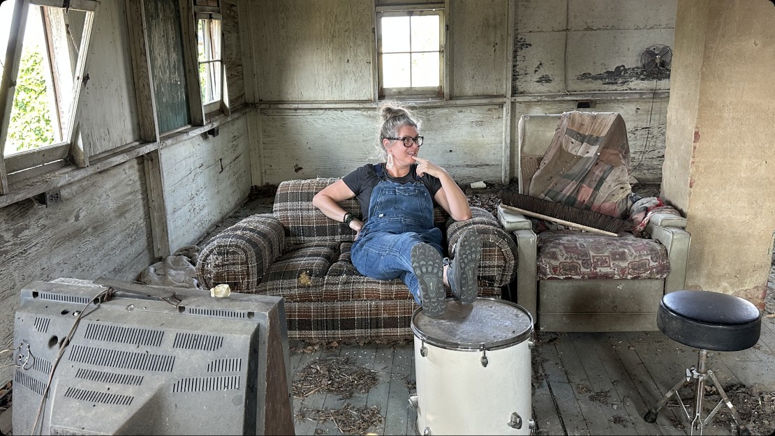
ROOTED IN THE FARM.
Real growers, real fields, real blooms.
The photography captures the joy, the work and the quiet connection between people and dahlias, from the field to the shed.
THE STRATEGY
PROOF, NOT PROMISES.
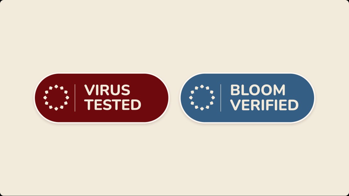
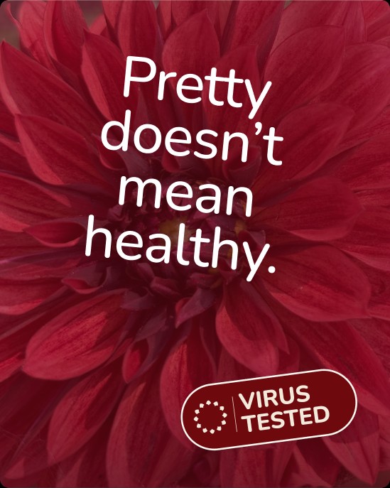
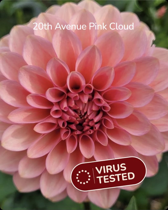
Testing happens in a lab, out of sight. So we turned it into marks people can see.
Built from the Kaya emblem, Virus Tested stands for lab-tested, clean stock, and Bloom Verified for blooms checked by Kaya herself.
THE KAYA STANDARD
A GUIDE, NOT A PITCH.
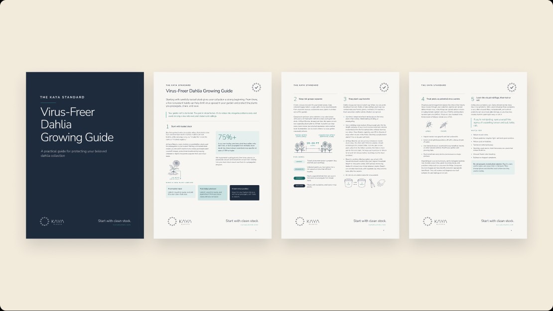
A free, seven-rule growing guide that makes Kaya the authority on clean stock.
It teaches growers to protect their own collections, from testing new stock to keeping risk zones apart, and gives every customer a reason to come back.
COMMUNICATIONS
ONE IDEA. MANY WAYS TO SAY IT.
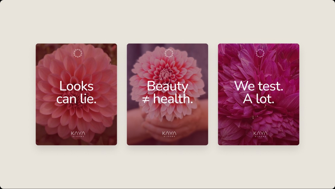
Short, provocative lines over the most beautiful blooms.
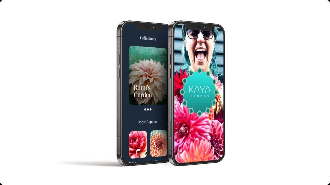
Pretty doesn’t mean healthy. A social series, a mobile shop and a presale countdown turned an invisible problem into a conversation growers wanted to join.

THE RESULT
PRETTY. AND HEALTHY.
Strategy, identity, proof and storytelling, working together to make clean stock the reason to choose Kaya.
The goal was never just a prettier brand. It was to make growers care about what they can’t see.
START A PROJECT →